

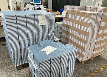

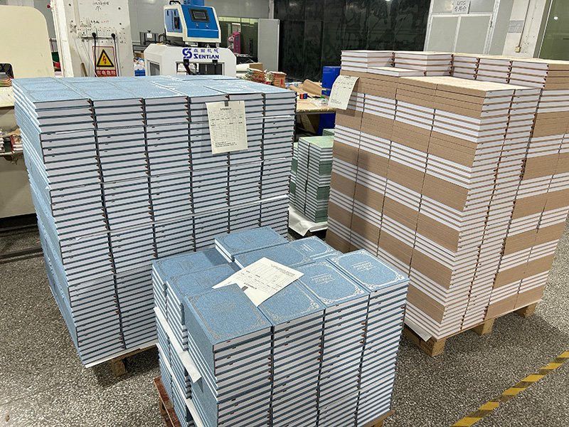
You know how most people lose their minds over notebook covers—leather this, fabric that? Yeah, I used to be one of them. Turns out the paper is what actually gives the whole thing its soul. When I first started printing custom notebooks I went full nerd: I showed up with a laundry list of fancy specs thinking I was hot stuff. The books came back and… man, they were terrible. Ink bled like crazy, pages made that awful crinkly sound when you flipped them, and they felt cheaper than the $10 spiral ones at the drugstore. Total rookie move.
So let’s talk real talk about picking the right paper. No textbook jargon, just the lessons I paid for with wasted money and embarrassed clients.
First thing: figure out what the notebook is actually for. Sounds obvious, right? I once printed a batch of fancy meeting notebooks for a friend. Thought “business = premium,” so I grabbed this thick, creamy Daolin paper. It looked expensive as hell… until people actually used it. Ballpoint pens kept sliding around, and the damn thing weighed a ton. Everyone complained it felt like carrying a brick to every meeting. Classic case of “looked good on paper, sucked in real life.”
If you’re just doing everyday scribbles—brain dumps, to-do lists, random thoughts—80 to 100 gsm uncoated paper is sweet spot territory. Anything lighter (60–70 gsm) and your fountain pen or gel pen shows through on the back side. Super annoying when you can read the next page’s writing. 100 gsm gives you just enough weight without turning the notebook into a doorstop.
Need something for sketching, hand-lettering, or slapping photos and washi tape all over it? Bump it up to 120 gsm and higher. My friend who’s obsessed with bullet journals swears by 140 gsm stuff. Watercolor markers don’t bleed through, tape doesn’t wrinkle the page, and every flip has that satisfying “thunk” sound. Total dopamine hit.
Paper color matters way more than you’d think—and whiter isn’t always better. I used to chase the brightest white possible because it “looked clean.” Then I actually tried writing in one at night under a lamp and my eyes were screaming after ten minutes. That harsh glare is brutal.
These days the good stuff leans toward off-white, ivory, or that soft cream color on purpose. It feels warmer, easier on the eyes, and somehow makes you want to write. My daily driver is a creamy ivory and I swear it just feels friendlier. Of course, if you’re doing super formal corporate meeting logs or client reports, a clean bright white still wins for that crisp professional vibe. Personal preference, no hard rules.
Now the feel of the surface—smooth or with some tooth? This one trips people up. Super-slick coated papers (the really glossy high-gsm ones) make ballpoints and gel pens glide like butter… but fountain pens take forever to dry and one accidental swipe of your hand turns your whole paragraph into a smudge-fest. I’ve done it. Not fun.
On the flip side, papers with a little texture—like uncoated Munken or some specialty stocks—give you that lovely “scratchy” resistance when you write. It feels intentional, almost meditative. The downside? Ink absorbs faster so colors can look a touch muted, and super-vibrant printed graphics don’t pop quite as hard. Trade-off.
One thing almost nobody talks about but will save your sanity: paper stiffness. You know those notebooks where you open to the middle and the pages keep trying to flip themselves back? Or the edges start curling up after a few weeks like they got caught in the rain? That’s poor stiffness. Heavier paper usually helps, but it’s also about fiber direction and how it’s bound. If your notebook is going to get tossed in a backpack, flipped through constantly (student notes, field journals, etc.), spend the extra few cents on stock with good stiffness. Otherwise it turns into a floppy mess in a month.
Quick story that still makes me cringe: Last year I printed a bunch of client gifts on the cheapest 70 gsm copy paper I could find. “It’s just a notebook,” I told myself. They came back so thin you could see the grid lines from the next page, and any pressure with a pen left little bumps on the back. I was mortified. Ended up eating the whole batch and never sent them out. Expensive lesson in “you get what you pay for.”
Bottom line? A notebook is something you touch and use every single day. Good paper is the part people feel instantly—even if they can’t name why. So yeah, you can cheap out on the cover if you want. But don’t skimp on the paper.
Here’s the cheat sheet I wish someone had handed me years ago:
- Everyday writing & notes: 80–100 gsm uncoated or Daolin, ivory or cream—easy on the eyes, nice weight.
- Sketching, journaling, photos & stickers: 120 gsm+, slightly textured for that premium feel.
- Formal business or meeting books: Around 100 gsm bright white—clean and professional.
- Anything that gets beat up a lot (students, field use): Prioritize stiffness so it doesn’t flop or curl.
Paper can get insanely technical—opacity, pH, surface strength, all that jazz. But honestly? Grab a sample pack, scribble on it with the pens you actually use, and trust your gut. If it feels good in your hand and makes you want to keep writing… that’s the winner. Everything else is just noise.